Showing posts with label Stampin Up. Show all posts

Two Ways to Package the Cash!

I always give my son and his girlfriend money for Christmas along with other smaller presents so they are able to get something they really want - that will fit - etc! This year I just gave them cash so they wouldn't even have to go to the bank to cash a check (my son sometimes forgets to cash a check for a while!) but I wanted to dress it up a little bit rather than just tuck it in an envelope....

So - for April - who loves purple - I made this cute little purse using a die from Papertrey Ink. I stamped the sentiment from Compliments of the Season by Waltzingmouse and then die cut it using Fancy Tags from Spellbinders - cutting off the left edge where I put my hand made felt flower. Then I just tied a piece of wrinkled seam tape around the handle as well as the roll of cash - which I then tucked inside the 'purse'!

For Josh I wanted a masculine look -so I used paper from Cosmo Cricket Wanted/Slim Jim. I cut two panels using the Top Note from Stampin Up, then I cut one in half and layered it over the full cut. I used Scor Tape on two sides and the bottom to hold it securely - then just stapled it to 'guy' it up!
I stamped the sentiment - again from Compliments of the Season from Waltzingmouse - and die cut it with Labels Sixteen Nestabilities. I adhered that to the bottom half. Then I added a jumbo brad and looped a piece of ribbon through tying it with twine.
I put a metal clip on the bills to hold them together and tucked them into the gift card! April always appreciates my special packaging - she will put this on her desk at work or on a shelf at home.

Thanks so much for stopping by today!
Purse:
Stamps: Waltzingmouse - Compliments of the Season
Paper: Vintage Cream - PTI, DP My Minds Eye 29th St Market
Ink: Memento Tuxedo Black, Ranger Distress Milled Lavender
Accessories: Favor it Box 1 - Papertrey Ink, Fancy Tags - Spellbinders, Felt & sticky pearls - Michaels, Scotch Quick Dry Adhesive, wrinkled seam tape - http://www.prairiebirdboutique.etsy.com
Top Note:
Stamps: Waltzingmouse - Compliments of the Season
Paper: Creamy Caramel - SU, DP Cosmo Cricket/Wanted/Slim Jim
Ink: Memento Tuxedo Black, Ranger Distress - Tea Dye
Accessories: Labels 16 Nestabilities, Top Note Die, Jumbo Eyelets, & Ribbon Originals Alpine - Stampin Up, Twine - PTI, friend metal clip - Making Memories, Staples - Close to my Heart.

A Golden Tree of Love

This week Nichole (butterfly ears) was the featured stamper over on Split Coast. I cased her pretty fruity Friday topiary card .


I knew this roses topiary from Rubbernecker Stamps would be perfect as a substitute for her fruit tree. I embossed both the topiary and the hearts background with gold EP. I colored the image with Copics. I used the Top Note die to cut the hearts background. Several of the layers are up on foam dimensionals.

Doesn't the gold card stock set it all off nicely?

Under Fun News: Cindy Motherway (AKA Mothermark and da Mudder of teapot Tuesday fame on SCS) is joining us on the Rubbernecker Design team- Whoo Hoo!! h0w fun is that! Welcome to the team GF!


Reminder: Don't forget to come back on Thursday afternoon for the Waltzingmouse Blog Hop! there will be two stamp sets up for grabs!!!


Be sure to check out Claire's blog - she'll be having sneak peeks everyday until the release and will also be letting you know which DT members are posting more sneak peeks!

Thanks for stopping by today!


Stamps: Rubbernecker From the Heart: Heart Background #28-10, , Heart Topiary #246-03
Paper: White -PTI, Gold unknown
Ink: versamark
Accessories: zutter corner rounder, rectangle & scallop rectangle nestabilities, foam dimensionsla, gold ribbon - PTI, Copics: G20, YG03, YG63, E11, E19, R29, R20, Top Note die - SU

Come for Tea and a Hair Cut!

This week's Teapot Tuesday over on Split Coast was a wonderful castle teapot. I was inspired by the castle walls and made this card using a fun mosaic tile stamp from Starving Artists that I've had for ages but never inked up yet.(I say that about so many stamps! LOL!)
You ink the stamp with Versamark - then over stamp it in a color using a flower stamp (or whatever) stamp it on card stock - and then clear emboss it. I love how it came out!
The window and sentiment are also from Starving Artistamps/Doodle Factory. The story is that Rapunzle is a hairdresser in the castle and she's trying to drum up business. Hopefully this pretty wall will be inviting to people who walk by and they'll stop in for Rapunzle to cut their hair - ya think??
This also fits the Tuesday Doubledog Dare challenge this week where jdmommy (Anne) challenged us to use some kind of frame on our card. I used a window frame!
Stamps: tile - Starving Artistamps, Window & Sentiment - Starving Artist Stamps/Doodle Factory, flowers - Essence of Love - SU
Paper: white - PTI, Sahara Sand - SU
Ink: Versamark, Ocean Tides - PTI, Memento Tuxedo black
Accessories: clear EP, hot gun, foam dimensionals, labels eight nestabilities, cuttlbbug, xacto knife

A Thanksgiving Ship and a Strawberry B'day

I promised to share with you the projects I taught at my class at the Paper Tree this weekend. We made this great Mayflower ship and two clean and simple Thanksgiving cards. The sail is made using the Labels Eight Nestabilities. I inked all over them with a Chai ink cube. The paper for the ships is woodgrain by Amuse.

The template for this super ship was made by Qbee and can be found on Split Coast here. It's the perfect size to place at each guests seat at your Thanksgiving table filled with nuts or candys. Last year I made some and stamped everyone's name on the sail as place markers.
The cards are each 4x4 size with score lines at top and bottom. The cute turkey wagon stamp is by Amuse. (may be retired). The sentiment is Just Rite Stamps - Brayton Font 50 pt

This fun pilgrim hat is by Inkadinkado (may be retired) and the sentiment is by Hero Arts. I colored both images with Copics.

On this Mayflower the stamps are Stampin up - Hello from All Occasions Sayings and Happy Thanksgiving from All Year Cheer III (I think both sets are retired)

I love how cute these are! And they go together really easily - I'm making them for everyone this year!

Next up is my card for the challenge on Split Coast today.

Dawn (treasureoiler) was the featured stamper . I needed to make a b'day card for my 4 year old God-Daughter, Eden and I knew I'd find a wonderful card to CASE because Dawn uses lots of cute little girl stamps on her cards!

Sure enough I found this adorable card to CASE.

I changed the image, the colors and added a lacey punched edge as well as the number 4.

Eden loves Strawberry Shortcake - so I found an image on line and printed it on card stock. I colored it with Copics and framed it with circle Nestabilities. I added a couple of gemstones for a touch of glitter! I'll be giving her this tomorrow night along with a few gifts - we're getting together for a little tea party!
Thanks so much for coming by!
Stamps: the number 4 - Clear Art Stamps Birthday set
Paper: Pure Poppy, white - PTI, Sage Shadow - SU, DP Cosmo Cricket - Early bird/cherry pie
Ink: Pure Poppy - PTI
Accessories: Strawberry Shortcake image from web, Circle nestability, pinking circle nestability, scalloped circle punch, circle punches, foam dimensionals, saddle stitched ribbon Ocean Tides - PTI, Martha Stewart lacey punch, Copics: BG10, BG11, YGo5, YG09, Yo2, RV1

Mojo Sketch and Santa's Bag

The Ways to use It Challenge on Split Coast this week was to use stickers or rub ons on your card. I have several packages of rub ons but I always forget to use them. I found these pretty Christmas ones in my craft room from Stampin Up that I bought last year when they were on sale and knew they'd be just the thing for the challenge!

I used the mojomonday sketch for my card. I just touched Santa's cheeks with a blush Copic for a dash of color - I wasn't sure if it would stay on the rub on - but it did! The great papers are Cosmo Cricket Jolly by Golly.

Stamps: none
Paper: Vintage cream, ocean tides, dark chocolate - PTI
Ink: chamomile - PTI
Accessories: Copic R20, Rub Ons - SU Old St. Nick, classic oval nestability, Alpine Ribbon - SU, foam dimensionals, glue dots, vintage buttons - PTI


And here is the third treat bag that the elves dropped off at my house last week (see post here)

This cute baglette is from the big guy himself (Santa that is!) but I'm sure the elves designed and made it for him to givw out! The shape looks surprisingly like the Top Note by Stampin Up and this is the official Santa's workshop seal on the front. How fun that they attached a little reindeer and snowflake on the corners to give the North Pole atmosphere!

Inside they tucked more of those fun mints with the Seal of the Chief Elf on them - again - an official mark so we know these are the real thing straight from the North Pole!
And on the back - a personal note from Santa (doesn't he have lovely handwriting?!?) for the kids (and parents!) who have left him a little treat to give him strength for his travels Christmas Eve. Santa is nothing if not a gentleman - get a treat, give a treat!

Now - you can find very similar stamps to those used on this project by the elves above over at Claire's shop Waltzingmouse Stamps. Check out her other two new sets while you are over there - you'll definately want to pick up one or two! And - just a suggestion - if you like it - buy it - she sells out fast on her lovely stamps!

Thanks so much for stopping by today!
Stamps: Waltzingmouse Secret Set
Paper: Ribe Avocado, Pure Poppy - PTI, DP - Cosmo Cricket Jolly by Golly/Merry Berry, sparkle white - DCWV
Ink: Memento Tuxedo Black, Chamomile Ink - PTI
Accessories: foam dimensionals, ribbon - SU, brads, silver Stickles, glue dots, reindeer & snowflake punches - Martha Stewart, Sakura gelly roll black pen, Top Note Die & horizontal slot punch - SU, scalloped circle punch, white paper sack - Michaels.

A Chilling Color Resist!

My card today is for two challenges - the color challenge on Split Coast and the Doubledog Dare Challenge I do with some Split Coast Friends - last week Hostess Charlene asked us to use crayon resist on our card.

You can find the tutorial for crayon resist in the resources over at Split Coast here

First I stamped this great skull image from the Stampin Up set called From the Crypt with black ink on glossy white paper -I let it dry (actually hot gunned it dry!) - then colored the skull with a white crayon. Next I sponged over the image using bravo burgandy and so saffron inks. I wiped the image with a paper towel and it stayed white where the crayon had been colored. I apparently missed a few areas on the skull with my crayon and it got colored burgandy - but I like how that came out!

The framings are cut with the Labels 3 Nestabilities and the background spider web is a Cuttlebug Folder.

You can find the Doubledog Dare Challenges in the Split Coast forum here or on my sidebar.

Inside my card I stamped this very fun witch and BOO! from the Waltzingmouse Stamp set called Halloween Party.


Thank you so much for stopping by today!

I'm teaching a class over at The Papertree in Manchester, NH tomorrow morning so I've been busy preparing the materials for that. I always have such a great time there with all my stamping friends - and owner, Michelle, is just a blast to be around - not to mention how fun her store is - she's got all the new stamps and papers!! If you are ever in the Manchester, NH area - be sure to stop by there.

AND - I'll be revealing some exciting news I've been dying to tell you for a month or so coming up on my blog on Tuesday 9/29 so be sure to come by for that!!
Stamps: SU: From the Crypt
Paper: Bravo burgandy, Basic Black, Glossy Paper: SU, Summer Sunrise: PTI,
Ink: Bravo Burgandy, So Saffron: SU, Memento Tuxedo Black
Accessories: Sponge, foam dimensionals, labels 3 Nestabilities, Spider Web Cuttlebug Folder, white crayon

A Hundred Thousand Welcomes in the Trees

I made this card using this weeks sketch challenge at Split Coast. I turned the sketch on it's side to accomodate my pretty trees. Can you believe how these Stampin Up Trendy Trees match the trees in this designer paper?! And did you notice the cute owls on the bottom piece? I just got this paper last week at The Papertree in Manchester, NH where I teach classes once a month. It's Dream St. Papers/Sam and the owl one is called Hoot-Hoot and the tree one is called Seasons of Change.

Don't you just love the sentiment? It's from the Irish Blessings set by Waltzingmouse Stamps

Thanks for dropping by today!

Stamps: Trendy trees: SU, Sentiment: Irish Blessings - Waltzingmouse Stamps
Paper: Choc Chip: SU, Rustic Cream, Ocean Tides: PTI, DP Dream St. Papers/Sam -Hoot Hoot, Sam-Seasons of Change
Ink: Adirondack Sunset Orange, Dark Chocolate, Ocean Tides: PTI
Accessories: glue dots, sponge, dew drops, foam dimensionals, tag trio Spellbinders

A Chef's Announcement

This weeks Featured Stamper on Split Coast was my good stamping friend and Fellow Doubledog Dare Challenge Team member Joanne Travis (sleepyinseattle). I CASED her fun chef card

I missed making this fun stand up card when it was a new technique challenge on Split Coast and I just love Chef (Voila by Stamping Up) so this was the card for me! Anne (Itsapassion) - another good stamping buddy who is also on the DDC team - is having a special birthday this week - so I made this for her (Happy B'Day dearest Anne! This is in the mail to you along with a couple of treats!)

The card base is a Bazzill coral color and the designer paper is Basic Grey Porcelin. The cupcake is by Lockhart Stamps and I colored it with Copics. It's popped up on foam dimensionals and I added the Basic Grey Chipboard numbers on top!

On the back of the card I added two more stampings and this is where I signed the card.
Here are the copics I used on the cupcake and Chef's skin. His outfit is paperpieced with Bitty Box Basics by Papertrey Ink.

Thanks for coming by today! Leave me a comment so I can come visit you!!

Stamps: Chef: Voila SU, Cupcake: Lockhart Stamps, Sentiment: clearartstamps
Paper: Bazzill, White, Bitty Box Basics, White: PTI, basic black: SU, DP: Basic Grey: Porcelin/Hampton
Ink: Memento Tuxedo Black, Berry Sorbet: PTI
Accessories: sponge, dotted satin ribbon: PTI, chib board sticker numbers: Basic Grey, Pinking Circle, circle: Nestabilities, sugar coated brad: Doodlebug Design, Spellbinders Tag 5, foam dimensionals, copics

God is Never Changing

If you've visited my blog this past week - you know that I was on vacation and not stamping! And I'm SO HAPPY to be at it again! I think we all need an occasional break but then it's wonderful to get back to it too! (I know you are all nodding your heads in agreement!)


I just had to do the Featured Stamper challenge on Split Coast - Teresa has a wonderful gallery and I could have chosen several to case. I finally picked this pretty card - first because I love that Stampin Up ribbon and I never seem to use it - and also because I liked the sketch. I changed the designer paper and stamps and I didn't do stitching - I did a little doodling and added corners and a border on the bottom instead.


Instead of a card - I made mine a 6x6 scrapbook page as this project is also for the His Holy Name challenge that I do every other Sunday. For Week 15 Patter gave us God's Attribute of Immutable (never changing). What a comfort to know that God does not change - that he will always be there loving and caring for us!

You can join in on the Holy Name challenges at any time - click the link on my sidebar to get to Patter's blog. She posts them there as well as on Split Coast.


Stamps: In Bloom: PTI, Karen Foster Snap Stamps
Paper: White, Purepoppy, TextStyle In Bloom: PTI, Basic Black: SU
Ink: Menento Tuxedo Black, Pure Poppy: PTI
Accessories: Modern Label PUnch, Photo Corner Punch: SU,, Striped Grosgrain Ribbon: SU, Jumbo Eyelets, SU, Cropadile, Type Key Letter Stickers: Nostalgiques/Sticko, Foam dimensionals, Pinking scissors: Fiskars, Micron Pen Black, Distresser: Heidi Swapp, sponge

A Knight at the Castle

Aren't these castles just the cutest things??? You can find Claire Brennan's tutorial for them here. They are about 12" in height including the flag pole!

I made this one using the fun Basic Grey Lime Rickey/Liquid Candy designer paper for the castle panels. The base is a green Bazzill card stock. The knight is from Lizzie Anne Designs and the trees and sentiment are from two different Cornish Heritage Farms sets - Making the Grade and Forest Friendzy. I adhered a tree on each side of the castle as well as a hedgehog or mushroom.

These are all the stampings I used on the castle and the card below.

Here is a card I made to go along with the castle - using the same stamps. I used the Forest Branches Cuttlebug folder on the back panel and a Labels Four Nestability to cut the piece of designer paper. All the images are colored with Copics. I used the small oval Stampin Up punch for the sentiment on the castle. For the card sentiment I juse used the corner rounder on one end and cut out a triangle on the other end. Everything is popped up on foam dimensionals.

I made this second castle a little more sedate. I thought it would be a fun Welcome to your New Home gift with some treats tucked inside. The sentiment is from Amuse and says "May your house always be too small to hold all your friends." Irish Proverb

This designer paper is Basic Grey Porcelain/bellamy. The base of the castle is Certainly Celery by Stampin Up. The chipboard trees are from Maya Road.

On this castle I used the Distressed Stripes Cuttlebug folder on the roof piece and inked it with white chalk ink as suggested by Claire in her tutorial. The flag is just a strip of designer paper curled and glued around a toothpick with a triangle cut out of the end.

And here is the coordinating card I made for this castle.
The uses for this cute castle are limitless - wouldn't it be fun in pink and purples with a princess stamp for a little girls b'day? And they aren't as hard to make as they look - Claire goes through each step with pictures and written descriptions. I made one up with computer paper first just to be sure I understood each step - that way I didn't waste good card stock in the learning process!
Thought you might like to see a few pics of our vacation: Here is a side view of my SIL's cottage in the woods from the driveway.
and here is the front view - we can see a little bit of Merry Meeting Lake through the trees - which is behind me as I'm taking this pic - the cottage is across the street from the lake but we have a right-of-way where we can access it. Here is Kent on the lake - and you can see the front of my kayak - we were out for two hours on this day - and just after we got back and up to the cottage we had a downpour! Rain can come quickly when you are in between the mountains here.And here's me! The water was pretty calm going down but on our way back we were heading into the wind - and we really had to paddle!

This is one of our cats, Boo, sitting on the favorite pet sofa by the picture window - watching Kent as he makes his way to the door!

Thanks for coming by today!

A Summer Angel

I made this card for the Featured Stamper challenge this week on Split Coast. Minnidr was the featured stamper and I chose her Spring Angel to CASE. I used an angel from the same stamp company but one holding a bird instead of flowers and I used a different bloom stem stamp (Simply Said by SU) which I also over stamped on the top panel. I added little plastic flowers and gems over some of the stamped blossoms. I also added a sentiment to the top of the card.


Reminder: check here for info on winning my blog candy!

Stamps: Angels 3: American Art Stamps, Simply Said: SU
Paper: white: PTI, Basic Black: SU
Ink: Memento Tuxedo Black
Accessories: Copics, foam dimensionals, Zutter corner rounder, Sizzletts Lots of Tags Label 1: SU, Modern label punch: SU, gemstones: Hero Arts, Little flowers: unknown

A Clean and Simple Miss You

This weeks CAS challenge on Split Coast (Clean and Simple) was to use the rock and roll technique - I inked my flowers with the lighter Lavender Moon PTI ink - then rolled the edges of the stamp over the darker Plum Pudding PTI ink. Then stamped it - this technique gives a two color image with the darker on the outside and the lighter on the inside of the image.

This Eastern Bloom flower is my absolute favorite flower to stamp - I love the lines in it and how great it looks cut out and curled. The stem is a sizzix die and I scored the edges of the card. I put some stickles in the centers of the flowers. Two of the flowers are cut out and popped up on thick foam dimensionals - the third one is stamped right on the card.
Thought I'd leave you with this picture from church on Mother's Day - this is Eden, my 3 year old God Child, and she gave me the pretty bouquet of flowers in front of me in the white box. They are in a round glass vase and are carnations, baby's breath and roses. She, of course, was more interested in her white grape juice and cookie! Don't you love her curls?!

Thanks for coming by today!
Stamps: Flower: Eastern Blooms: SU, Sentiment: Simple Little Things: PTI
Paper: white, ripe avocado: PTI
Ink: Lavender Moon, Plum Pudding: PTI
Accessories: sizzix die - leaf stem, cuttlebug, scor pal, stickles, thick foam dimensionals

Little Ribbons of Get Well

I'm catching up on the challenges today - so this card uses little bits of ribbon for the Split Coast Clean and Simple challenge and the colors red, old olive, black and cream for the color challenge.

I used my new Top Note (finally caved and bought it and I LOVE IT - don't look at this card Anne Harada! - she's still resisting the purchase! LOL!) I colored the leaf with my Stampin Up Old Olive marker to get that color in as required for the challenge. The stamps are from Papertrey Ink - the leaf is from the Friends Till the End set and the sentiment is from the Tea for Two set. The big brad is solid black but there is a little glare showing on it in the picture. The top note is up on dimensionals.

Short post tonight - I'm off to eat supper and then into my stamping room again - got some projects I'm working on! Thanks so much for stopping by!


Stamps: Friends till the end, Tea for Two: PTI
Paper: Pure Poppy, Vintage Cream: PTI
Ink: Memento Tuxedo black
Accessories: Old Olive SU Marker, glue dots, foam dimensionals, true black top notch twill: PTI, brad: American Crafts, Delphinium Petals: Darcie Finishing accents, Top Note die: SU, cuttlebug

Ninety & 100

2nd ETA: I did add the E to Ninety on my card - I guess I had a brain slip when I was stamping out the letters!!! It looks much better with the E! Duh.....

Wow - it's so good to be back stamping! Did you miss me???!!! Or maybe you didn't realize I was gone for a few days?!?! LOL!

Well - my cards today were made with 2 purposes in mind. First- I wanted to do the Featured Stamper challenge at Splitcoast. Today's FS was Kathy (Wattle) and I chose this card of her's to case. I changed the colors (made mine feminine) and used Labels One for my framings, and made it square.

I read on Amy Tsuruta 's blog about her friend Amy in Canada - who is trying to gather cards for two ladies she knows. Bea is turning 100 years old in Sept and the Mary is turning 90 in Nov and she wants to gather 100 and 90 cards respectively. So I thought I'd help her along by sending one for each lady. The card I chose today in Kathy's gallery gave me the push to get my cards done!

I've had the Headline Alphabet Stamps from Stampin Up (retired) for ever - and I think I've only used them once before - so I was glad to have a reason to ink them up. And I added pearls to the corners because every young lady needs to have her pearls on for her birthday - don't you agree!?!? ETA: I thought that you could spell 90 either ninty or ninety - and I left off the 'e' for spacing issues - but in looking at it - it now seems like I should add the 'e'! what do you think? I can change it before I mail it!!!

If you'd like to make cards for Bea and Mary too please send me an e-mail julia.aston@comcast.net and I'll be happy to e-mail you Amy's address for you to send them to.

DH and I went kayaking in the surprising 80 degree weather here today! We just got our kayaks at LL Bean a couple of weeks ago and were excited to be able to use them so early in the season. We have a little river that goes through our town so we just had to travel about a mile from our house to get in a nice ride today. Here is a pic of DH Kent that I took from my kayak - I had my camera in a special waterproof bag and took the pic right through the bag! ... so it's not as clear as it would be normally - but I think it came out pretty good considering!

Thanks for stopping by today!
Stamps: Headline Alphabet: SU, Mega Mixed Messages: PTI

Paper: White, Lavender Moon, Plum Pudding: PTI, DP Wisteria Basic Grey

Ink: Eggplant Adirondack, Lavender Moon: PTI

Accessories: Narrow rectangle Nestabilities, labels One Nestabilities, Paper Piercer, Textile Cuttlebug folder, cuttlebug, foam dimensionals, Crystal Sticker Pearls, Lavender Moon Luxe Satin Ribbon - PTI

An Inspired Black and White with a Doubledog Dash of Red

This weeks inspiration challenge on Split Coast was a web site store called Skeem. I was inspired by this tower candle.Anne (jdmommy) also Doubledog Dared our little challenge group to make a card using red, white and black so this inspiration fit that bill too - with my added red ribbon. You can join along with our Doubledog challenge - just use the keyword DDC. You can see all the Doubledog challenge cards here.Because the inspiration was clean and simple - I left the card without a sentiment or other embellishments. Inside I stamped a simple "Thanks for Your Kindness" from the Everyday Classics set from Papertrey Ink. (You cannot buy this set - you earned it free by buying 12 sets last year from PTI). Thanks for stopping by today - hope you have a lovely weekend!

Stamps: Fresh Cuts: SU , sentiment: Everyday Classics: PTI
Paper: Bazzill White, Basic Black: SU
Ink: versamark watermark ink
Accessories: white EP, hot gun, pure poppy luxe satin ribbon: PTI

The Essence of Love

Todays inspiration challenge on Split Coast was the Grandin Road web site. I was inspired by this botanical printI clear embossed my image on yellow card stock - and sponged all over the panel with brown ink. Then I cut the image in thirds and adhered the pieces over a blue panel. 
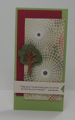
The sentiment is stamped on a Spellbinders double ended tag that is attached with foam dimensionals. I clear embossed the butterfly and attached it with a glue dot.


Today I went to see the musical Dirty Dancing with my sister and two nieces - what a great show it was! The set was just super and the dancers were wonderful - I can't believe that movie came out over 20 years ago!

I wish everyone a Blessed Easter and Passover Holiday!

Stamps: Essence of Love: SU
Paper: Choc Chip: SU, Spring rain, Lemon tart: PTI
Ink: Dark Chocolate: PTI, versamark watermark ink
Accessories: clear EP, hot gun, medijm brads: Making Memories, double ended tags: Spellbinders, sponge, foam dimensionals, glue dots, Martha Stewart Butterfly punch

Three Cards of Spring!

My cards are all about spring today! And to match my creations (or maybe it's the inspiration for!) - it's already 57 degrees here and bright and sunny! (after having 7" of new snow at the beginning of the week - this warmth is something to shout about!)

The inspiration challenge on Split Coast from Stef was a website called Spunky Sprouts. This wall decor was what inspired my imagination today.And this is the card I created. I kept it simple like the sample - I stamped the tree top, colored it with copics and cut it out.I stamped the tree on the white panel then adhered the tree top over it with foam dimensionals having the edges go 'out of the box' a bit. The stamps are all from H&M Stamps . The tree is from a new set called Seasons of Trees and the sentiment is from a sentiment set called A Time of Caring (retired).
Stamps: Seasons of Trees, A time of Caring: H&M Stamps
Paper: White, New Leaf: PTI
Ink: Onyx Black Versafine, New Leaf: PTI
Accessories: sponge, foam dimensionals, copics
I was so inspired by this site today that I made a second card for the inspiration challenge. The simplicity of this pretty pillow also caught my eye.
For this card I clear embossed the images which was Sharon's stamp simply challenge this week - to use embossing on a card. I used my Versamark Watermark embossing ink to stamp the images on my labels one nestability (I thought it gave the idea of the pillow shape!), sprinkled on the clear embossing powder - tapped it off - and heated it with my hot gun. Then I just knotted the double stitched ribbon around it to keep it clean and simple like the pillow.
Stamps: Pocket Silhouettes; SU
Paper: White, Ripe Avocado: PTI
Ink: Versamark watermark embossing pad
Accessories: Ripe Avocado saddle stitched ribbon: PTI, labels one nestabilities, clear EP, hot gun


And last but not least! Here is my less than 30 minute card for the limited supplies challenge on Split Coast - it took me 28 minutes to get this together! This bunny is a free digital image from Two Scoops Rice Designs that I got here. I printed the image and then colored it with copics, cut it out and layered it onto the Labels One nestability die cut using foam dimensionals. I sponged the edge of the die cut with white ink just to give it a little definition and also did faux stitching with a black micron pen.
I stamped the sentiment from Inky Antics and punched it out layering it to another punched circle and attaching it with foam dimensionals. and DONE!

Ok! I'm off to enjoy this beautiful weather God has given us today!! And later tonight DH and I are going out to dinner and then to a local Symphony with some friends.

Thanks so much for stopping by! See you soon!

Stamps: Two Scoops Rice Designs Stamps Digital Image, Sentiment: Inky antics
Paper: Bazzill, White: PTI
Ink: True Black, Fresh Snow: PTI
Accessories: black micron pen, labels One nestability, sponge, foam dimensionals, copics, signo white pen,